Does skittles.com make sense?
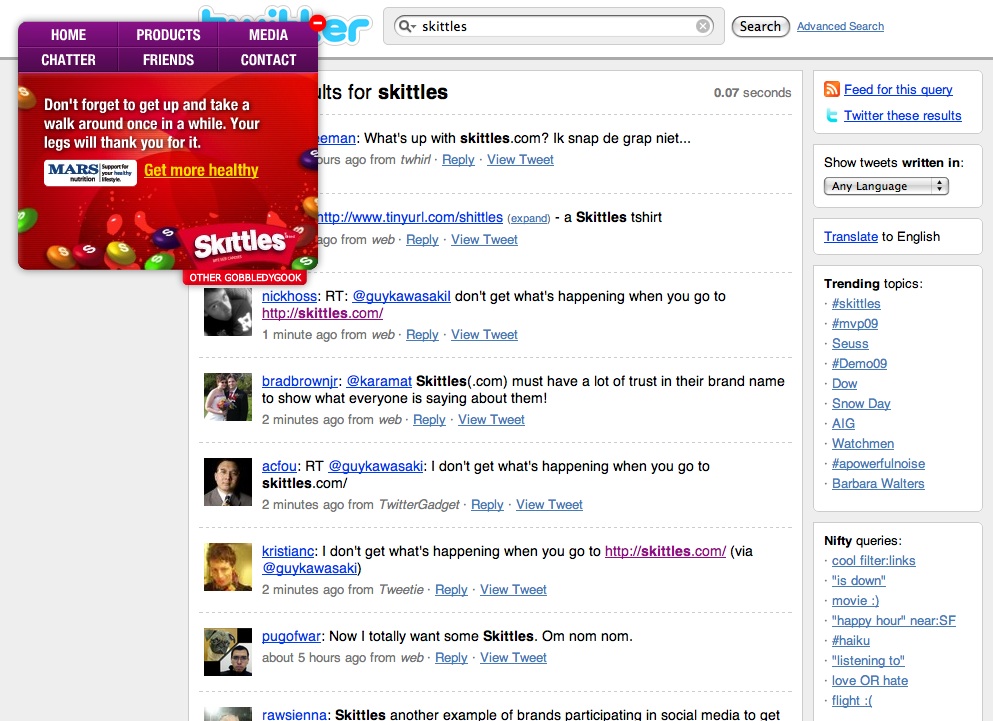
Skittles unveiled their new corporate site to much applause and some disdain by the Twitter community. Taking a cue perhaps, from agency.com, they have reduced their site to be nothing but a navigational overlay box on top of content provided by social network sites.

This works by making their:
- home page a Twitter search feed
- product pages, Wikipedia pages
- media pages both Flickr and YouTube feeds
- friends page a FaceBook page
So what is the upside for Sktittles? Well today, at least, they have generated plenty of free publicity. Going forward, they will have a lot of fresh content and perhaps some ongoing publicity.
But how about the downside? There are plenty of thoughts that pop into my head.
Perception
How will they be perceived by the social networking community or the social network sites themselves? Within several hours of launching their Flickr page was account "missing" and a "neutrality" warning was posted at the top of their Wikipedia article.

Skittles is "borrowing" a lot of bandwidth from these sites, for free, and what are they providing in return? Users of social network sites provide content, sometimes very interesting content, and that, along with increasing per-page impressions is the fee they pay for using a free service. What is Skittles giving back to the community?
"Social-ness"
The biggest part of being a part of "the social", and the part that companies often don't get, is that it's about 2-way communication. Kudos (excuse the pun), to Skittles for allowing their customers to have an unfiltered voice, but where are they in the conversation? We want to hear Skittles interact with their customers, not just hear ourselves talk about them.
Alienation
What is the experience for many of Skittle's potential customers? For instance, you now have to be 13 years old to view the site. And even if excluding kids from a candy store makes sense, what about the folks that are Web savvy, but not social network savvy. Perhaps this site will be a little weird to them. Which leads me to the biggest issue, usability.
Usability
Is the site usable? We all know that when considering usability, we must first consider our audience. Some would even go as far as saying that we can limit to a specific target audience, not just any possible site visitor. If we suppose what a target audience for Skittles might be, and even if that audience is entirely composed of social network aware individuals, would they find the site useable?
Well, next we would need to know the tasks the audience might engage in. Let's also suppose it's the following:
- find nutritional information - OK, it's available via Wikipedia, but can I be sure it hasn't been altered? I also need to do quite a bit of searching (e.g. reading and scrolling) to find it.
- find contact information - perhaps the easiest thing to do on the site and bonus points for not hiding the phone number
- search for information - not available at all. This is a complete failure for many web users who wish to visit a site and immediately search for the piece of information that they need.
So, in 3 tasks that I picked, the site only covers one well. But in addition, I see some other major usability hurdles:
- Poor feedback as to where you are in the site. While this is important in any site, it is very important in a site such as this where the context of the page you navigate to may differ greatly from where you came. e.g. will the user know that WikiPedia is the product page?
- Navigational overlay gets in the way. On many pages the navigation box seems to be on top of the content and it's not readily apparent how you shrink it.
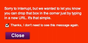
- Random pop-up explaining how to "drop the box in the corner". If you have to explain to your audience how to use your site, or worse, how to navigate away from it, you have failed at usability.

Lastly, while not a usability issue, it is odd that a promotional site would ask you to accept their terms and conditions before they tell you about their product. Given the nature of the content that may appear, I certainly understand the reason, but it seems like a big hoop for someone to jump through just to view your site.
To sum it up, I would say the new Skittles.com makes a great meme and a is perhaps a bit of Internet history, but to me, the site doesn't make sense. While I think that companies should be involved in social networking, it's very important how they approach it.
I can't wait to see what my colleagues at BrandLogic think about the impact this site has on the Skittles brand. And I would love to hear what you think. Please leave me your comments.
blog comments powered by Disqus